Top Tips For Creating a Stand-out Logo For Your Business
Businesses should change their logo every five years to stay ahead of the marketing game according to the experts so here’s our three top tips to help you create a logo that stands out.
Tweak or re-brand
If you already have a logo, the first thing to decide is whether you need a complete re-brand or just tweak your existing one. There can be huge financial implications if you go the whole hog depending on your business. For example, does it impact on infrastructure such as vehicles and buildings or is it a case of changing literature and marketing collateral?
Assess your current logo and see whether it is still relevant and reflects your brand. If it looks dated or irrelevant then it’s time for change. And if you’re starting from scratch then read on.
Brand messages
A logo should reflect your brands’ key messages and convey them. It is a short cut for customers to recognise and also know what your product is about. There is huge psychology behind logo design and what messages it imparts. From shapes (circles give a feeling of timelessness, whilst arrows suggest urgency according to the gurus), even colours, with red being seen as aggressive, so if you’re a spa, maybe not for you.
Even fonts trigger emotions, so choose your typeface with care and make sure is send the right signals, from trust to nostalgia.
And now new research reveals the best brands logos of all time, according to a study by leading promotional products retailer 4imprint.co.uk. A great place to start if you’re looking for inspiration for you and your business!
The promotional marketing experts polled the nation to discover the most iconic logos with The Nike ‘Swoosh’ at number 1 securing 44 percent of the vote, followed by the Apple ‘Bite’ logo for over a third (34 percent) and in third place was Mickey Mouse’s famous circular ears (21 percent).
And you can see why with the iconic Disney logo, we all get it’s about the mouse and the associated theme parks, films etc, similarly the Nike ‘Swoosh’ gives an impression of speed and activity.
The Apple icon, well what this says is that this is a company that does things differently. The brans is a disrupter who even runs ads without featuring its own products (such as the Genius campaign), so whilst not giving consumers a literal message, it tells us everything about the brand itself.
What your logo design says about your brand
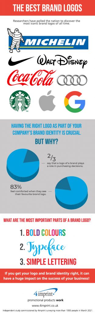
The study commissioned by the promotional products experts found that its researchers discovered the best brand logos of all time as voted by UK consumers. The report also gives helpful information on what designs consumers currently rate when it comes to which logos are the best to convey brand message.
Monogram logos such as Googlemail’s ‘M’ came top with 44 percent of the vote, followed by Wordmark logos such as VISA (41 percent) and Pictorial mark logos (or logo symbols) like Apple’s, came in third with 40 percent.
The report also revealed more than half (51 percent) think bold colours are the most important part of a brand logo, followed by typeface for a third of consumers and simple lettering for 30 percent.
And as the psychology of colour choice and the impact on your brand we touched on earlier, while red is seen as aggressive, yellow for example is perceived as youthful. Green is money or health, while pink is loving and purple is regal.